Case Study
Yellow is the new Green
Transforming a fragmented, Excel-based financial planning process into an interactive dashboard that helps decision-makers understand, explore and trust their data.
Overview
From scattered data to one source of truth.
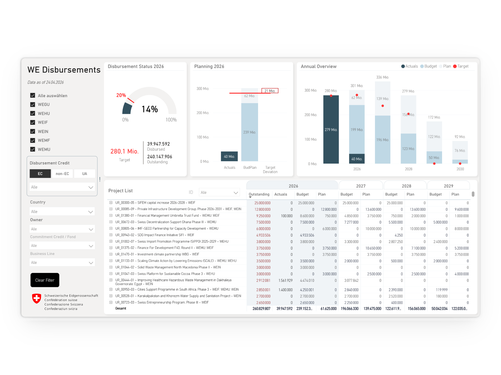
Financial planning at SECO's Economic Development and Cooperation division relied on manually maintained Excel files, screenshots and repeated explanations. Preparing for budget discussions often took days, and information quickly became outdated. The goal of the project was to create a single, interactive source of truth that would make financial data easier to access, understand and act upon.
Product
An interactive financial cockpit supporting the planning and monitoring of an annual budget of over CHF 400 million.
Users
Section Heads, Financial Controllers, Heads of Cooperation and Project Managers across SECO's Economic Cooperation and Development Division.
Team
Individual project
Problem
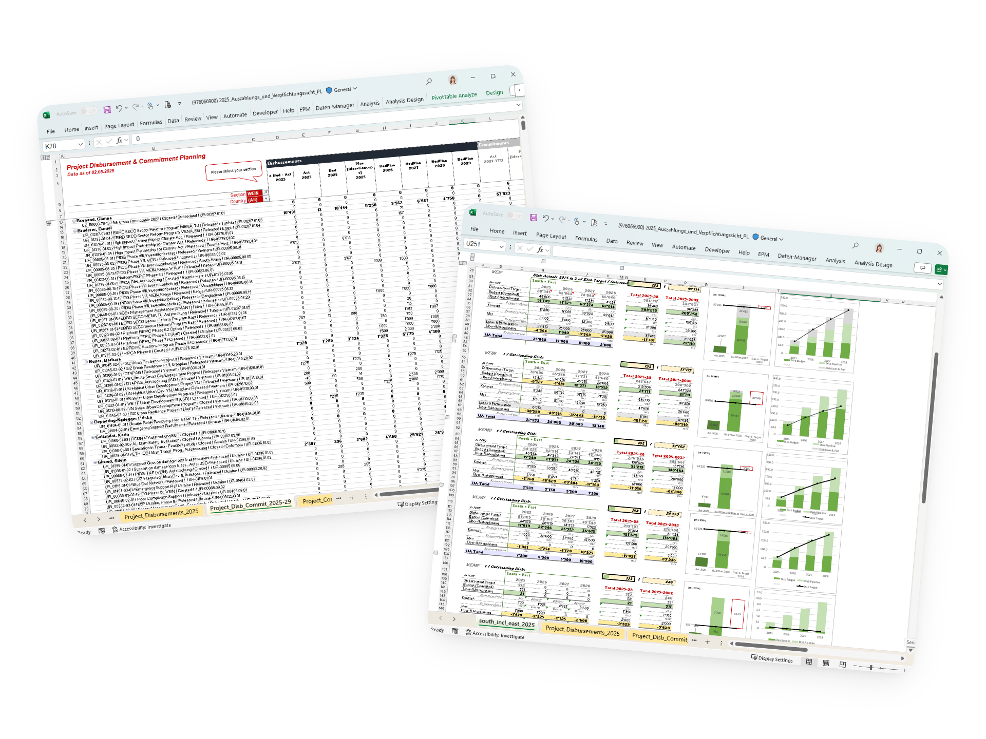
Important decisions were slowed down by fragmented information.
Time consuming
Users spent days preparing information before they could actually analyze and discuss it.
Limited exploration
Users could not easily filter, compare or drill into the data without creating additional views and calculations.
Limited trust
Because information was spread across several files, users often questioned whether they were working with the latest and most reliable data.
Role
End-to-end ownership of the product, from user research and UX/UI design to Power BI development, rollout and continuous iteration.
Constraints
With no prior Power BI experience, I designed and developed the solution alongside my regular responsibilities, requiring continuous learning and rapid upskilling throughout the project.
01
Research
From assumptions to insights.
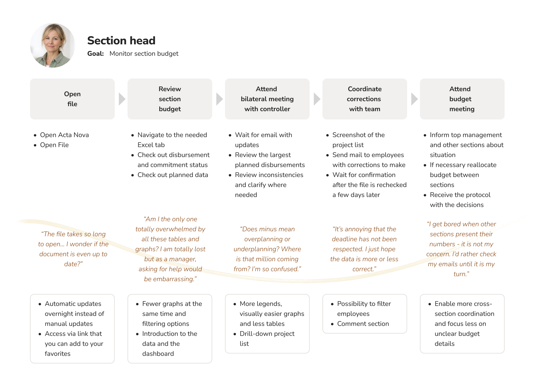
Although I already knew the users and their workflows well, I wanted to challenge my assumptions and better understand how they interacted with financial information. Mapping user journeys helped reveal recurring frustrations, uncover different needs across user groups and define the main pain points that ultimately shaped the dashboard.
Challenge
There were several user groups with different needs. Designing for everyone equally risked creating a dashboard that was too generic.
Solution
Map user types, identify primary users and prioritize the needs of the people who drive planning and decision-making, rather than those of the largest user group.
Who am I designing for




User journey map
02
Design
Designing for clarity.
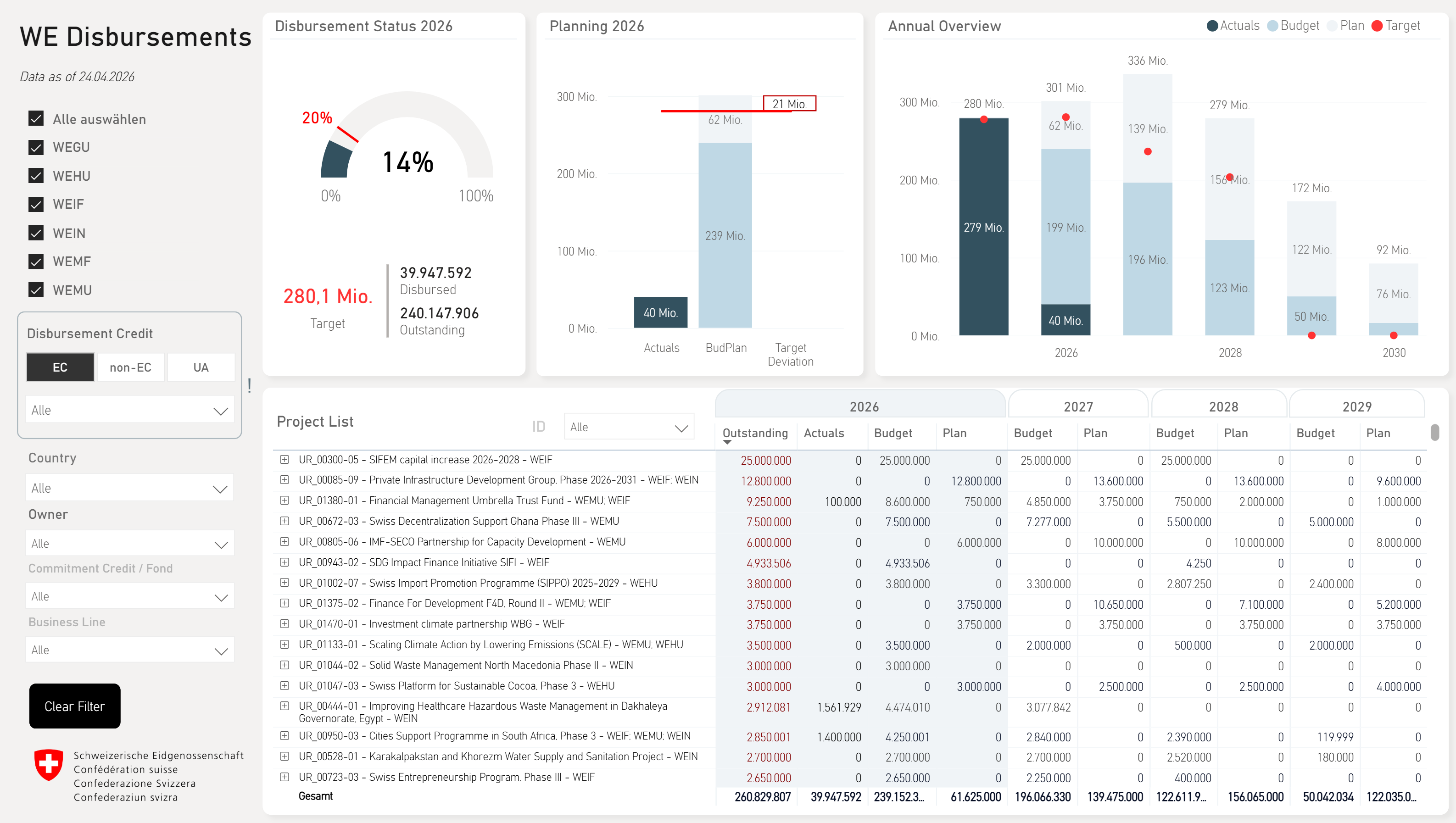
Financial data can easily feel dense and intimidating. The visual design therefore played a key role in making complex information approachable and supporting quick decision-making. Working within a public-sector context, I opted for a clean and restrained visual language inspired by existing Swiss government dashboards, prioritizing clarity, accessibility and trust over decoration.
Challenge
Making a CHF 400M financial planning process understandable at a glance while preserving the level of detail required for operational decision-making, all within the technical constraints of Power BI.
Solution
Careful use of visual hierarchy, filtering, progressive disclosure, color coding and interactive drill-downs allowed users to move seamlessly between strategic overviews and detailed project information. Every design decision was continuously validated against Power BI's technical constraints to ensure that the final experience could be implemented as intended.
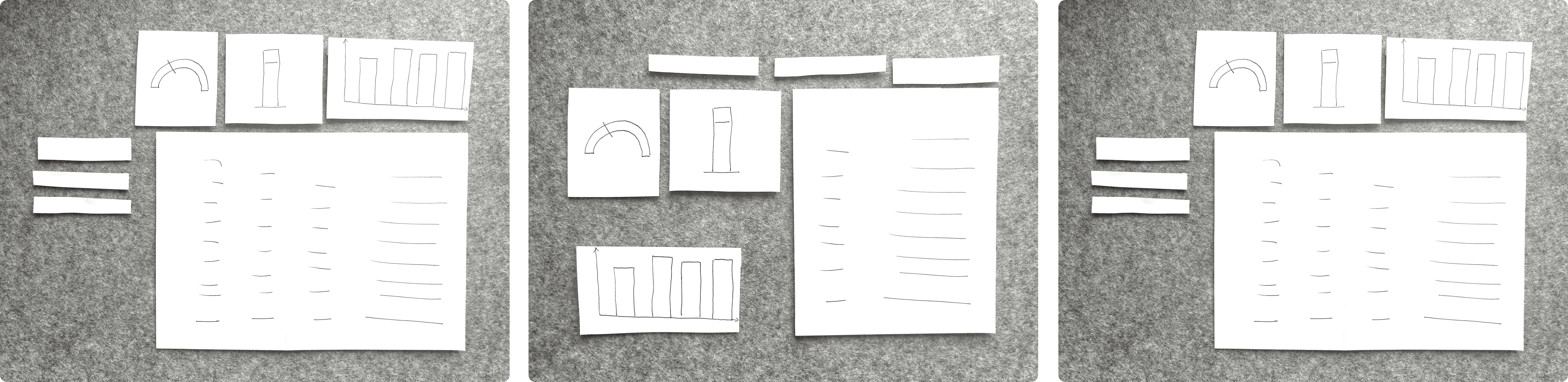
Using paper to generate ideas
Design decisions
Build trust through consistency
Consistent layouts, standardized metrics and a single source of truth help users understand the data faster and increase confidence in the information.
Optimize for high-impact users
Although several user groups used the dashboard, the experience was primarily designed around the needs of the people driving planning and budget decisions. Secondary users could still access the information they needed through filtering and drill-downs.
Leaving no one behind
Specific filters for non-primary user groups were added to ensure that all users could access the information they needed.
Choosing the right graphics
Preserving existing graphics where appropriate, while adding new ones where they added value.
Less color, more clarity
Rather than adopting the full departmental color palette, a restrained set of neutral tones was used to create a calm, data-focused interface. Federal red remains the only accent color, drawing attention where it matters without creating unnecessary visual clutter.
Make every pixel count
As the dashboard was intended for internal use, strict adherence to the official design system was not required. A more compact typeface was chosen to accommodate longer project titles.
03
Develop
Learning by doing.
Power BI was completely new territory for me. Through online training and extensive hands-on experimentation, I successfully delivered the solution while continuing my regular responsibilities. Introducing a new technology also required extensive stakeholder communication, change management and the creation of new access and governance processes around the dashboard. Within a year, I had become a recognized point of contact for dashboard design and Power BI within the organization.
Challenge
Bringing ambitious design ideas to life in an unfamiliar platform while introducing a new technology, defining governance processes and ensuring the final product could fully replace an existing business-critical process.
Solution
Breaking complex features into smaller problems, leveraging expert support and AI whenever technical challenges arose, and ensuring stakeholder buy-in through transparent communication, early involvement and continuous support.
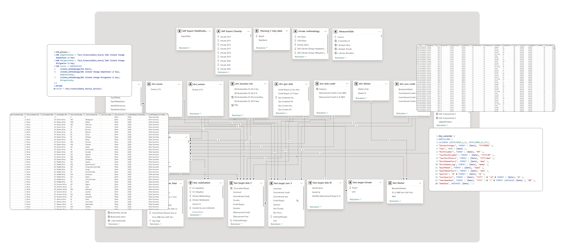
Data model in Power BI
04
Test
Does it actually work?
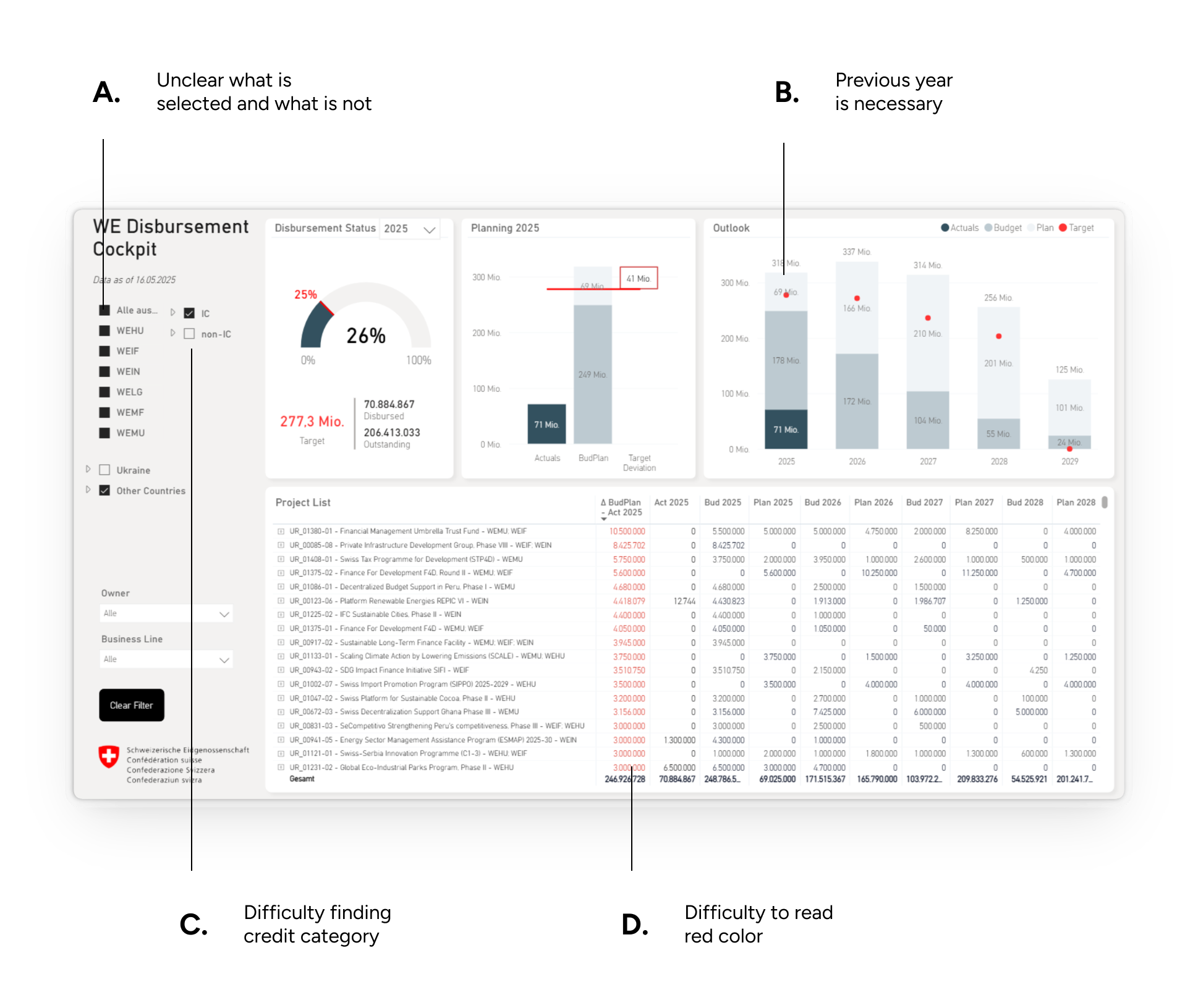
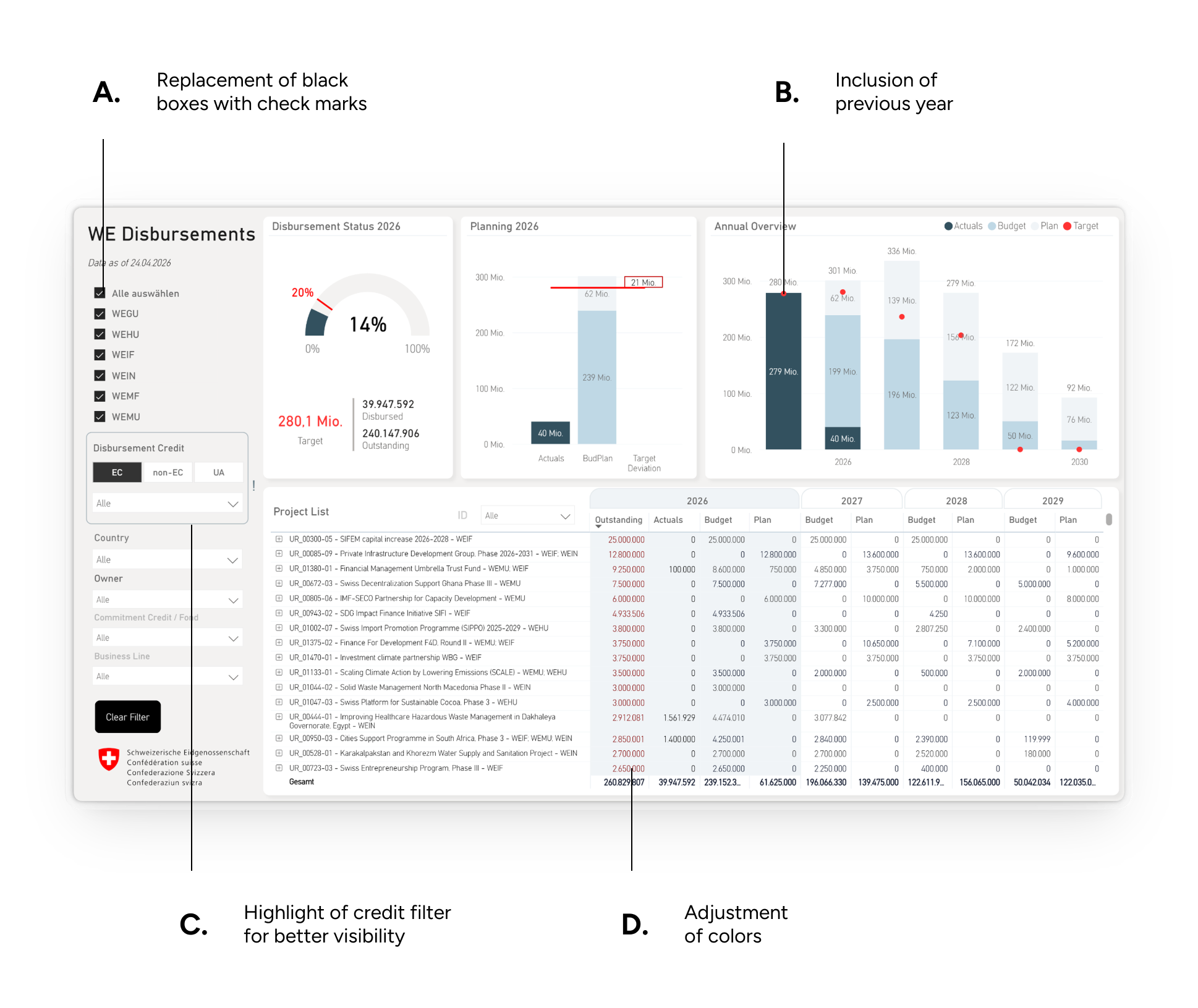
A moderated usability study with one section head and one project manager uncovered four key improvements before launch. Four months later, a questionnaire was distributed to section heads to evaluate adoption, usability and satisfaction. Ten out of twelve section heads responded, and the results confirmed strong acceptance of the new dashboard and way of working.
Challenge
Because the usability testing was conducted on a functional product, implementing changes required additional development effort and careful prioritization. Beyond usability, it was equally important to understand whether users would actually adopt this new way of working.
Solution
Combine targeted usability sessions to identify the most impactful improvements before launch with a post-launch questionnaire to validate adoption, satisfaction and long-term acceptance of the new way of working.
Iterations
Survey Results
83%
Found the dashboard easy to use.
100%
Consider it an improvement over the Excel file.
10/12
Section heads responded.
Qualitative feedback from the survey
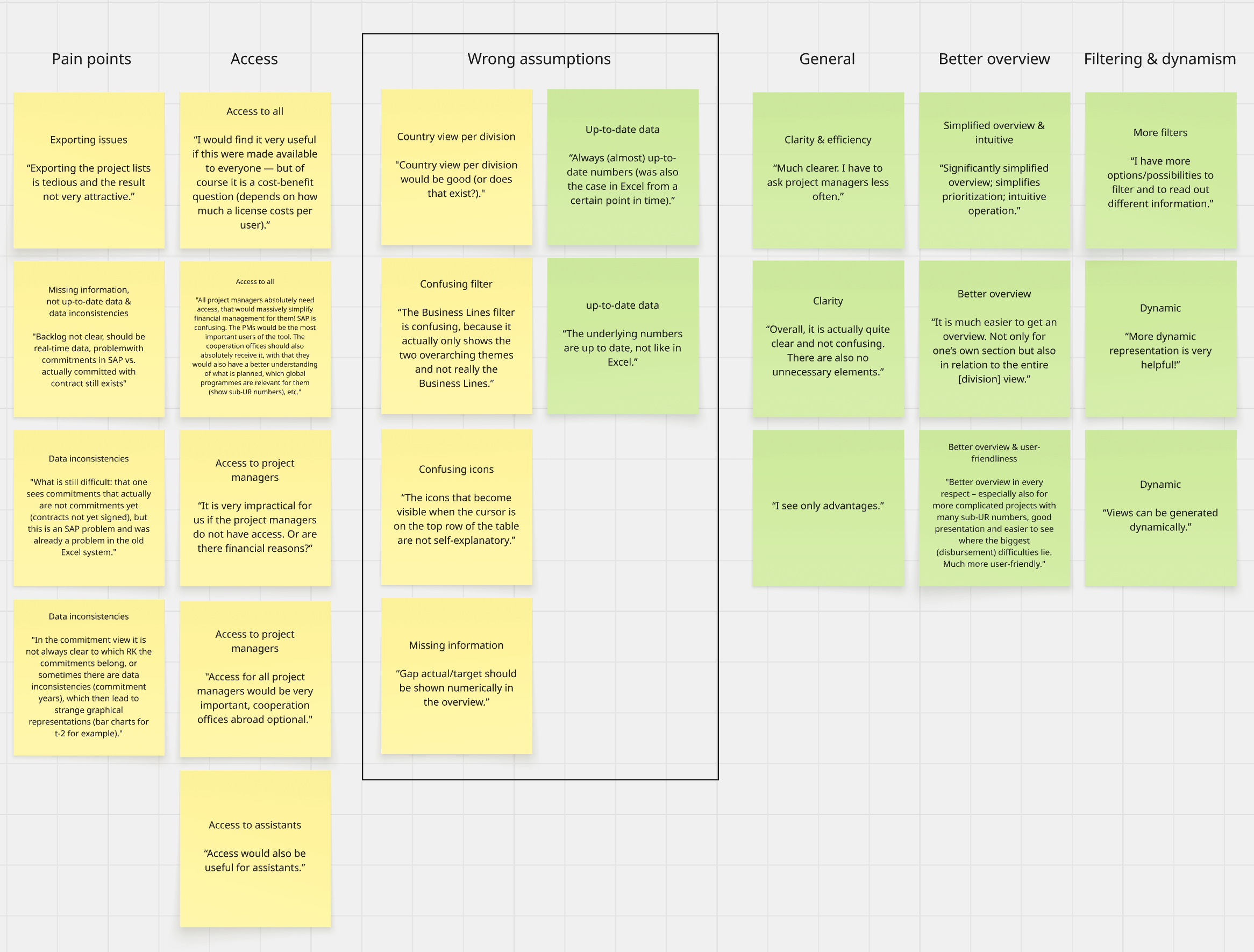
better overview in every respect, […] much more user-friendly
significantly simplified overview, simplifies priorization
I have to ask project managers less often
I see only advantages
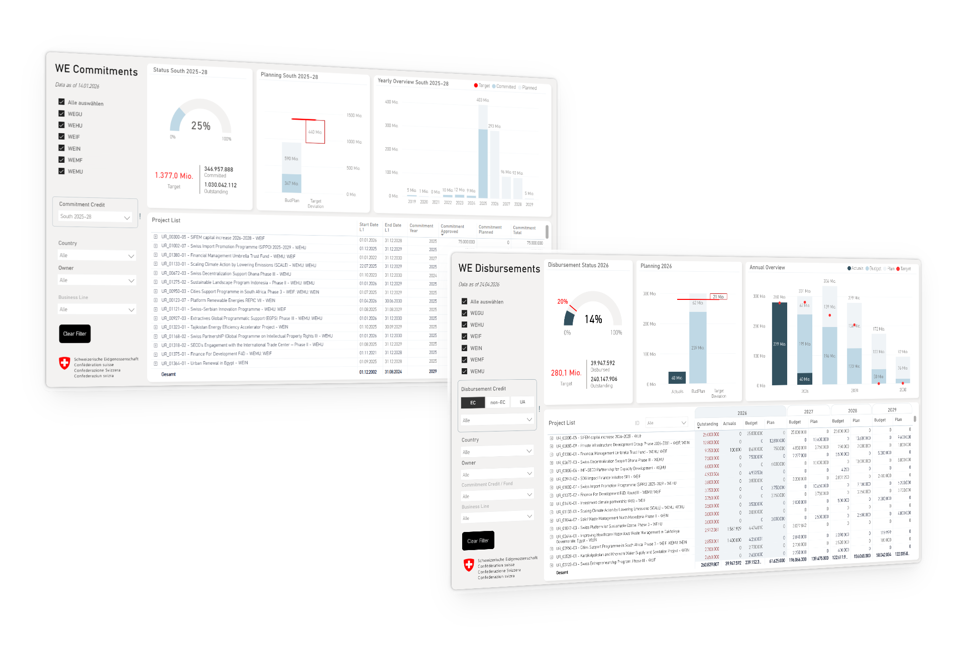
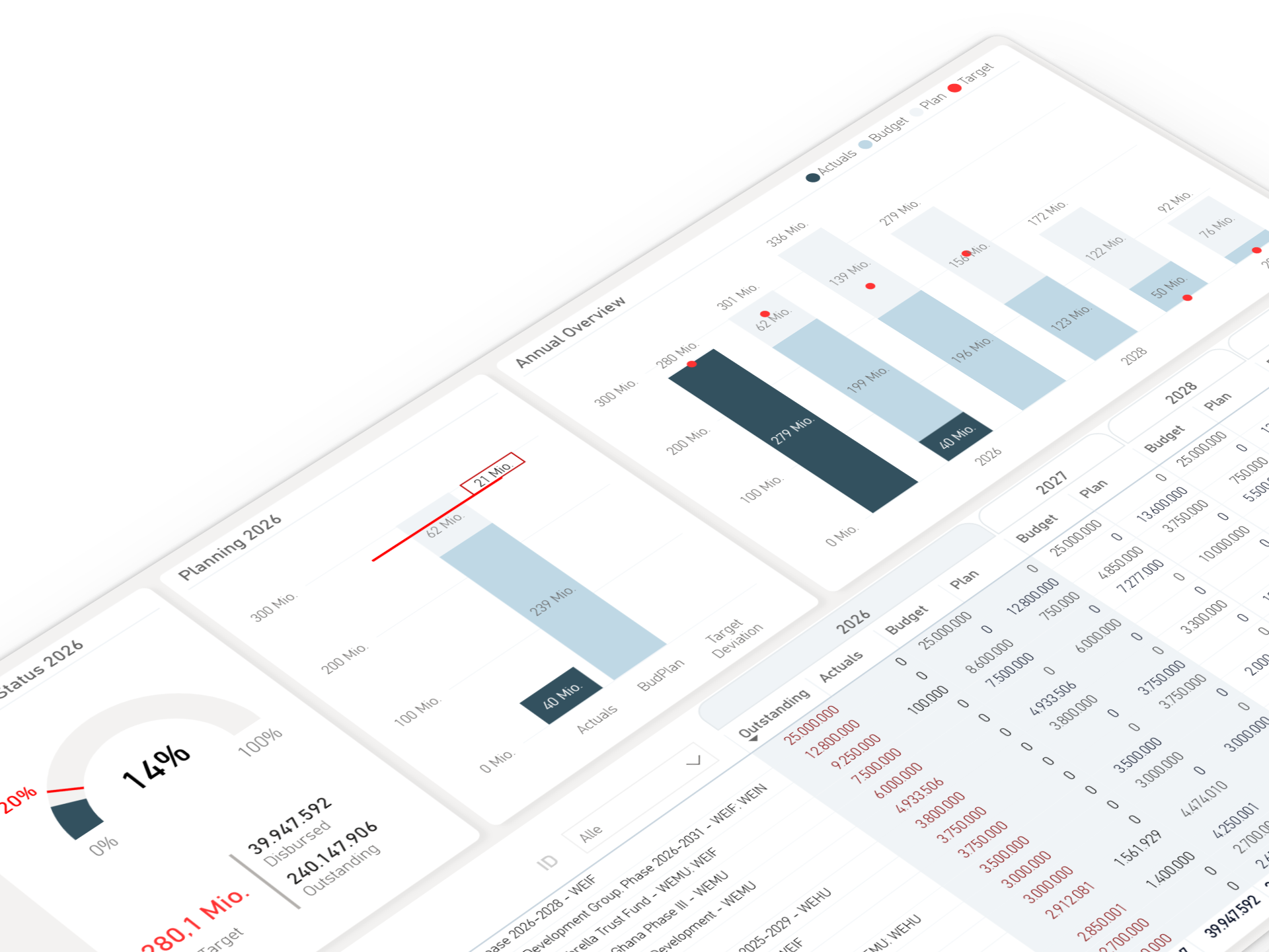
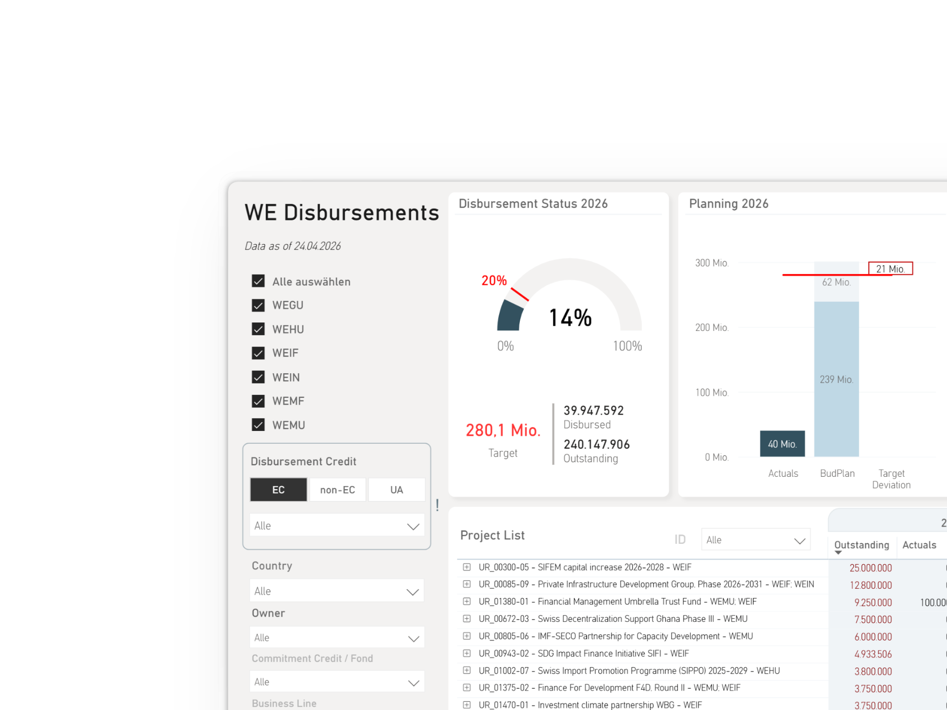
The Final Product
The Future is Yellow
Impact
From side project to strategic tool.
70%
Reduction in manual preparation work.
100%
Section heads considered the dashboard an improvement over the Excel file.
60%
Fewer recurring clarification requests.
The Afterlife
Evolving beyond launch.
What started as a financial cockpit gradually evolved into a broader reporting ecosystem. Over time, three additional pages were introduced to support new user needs, including two climate-focused dashboards inspired by my final project for the CAS in Data Visualization (see dedicated case study).
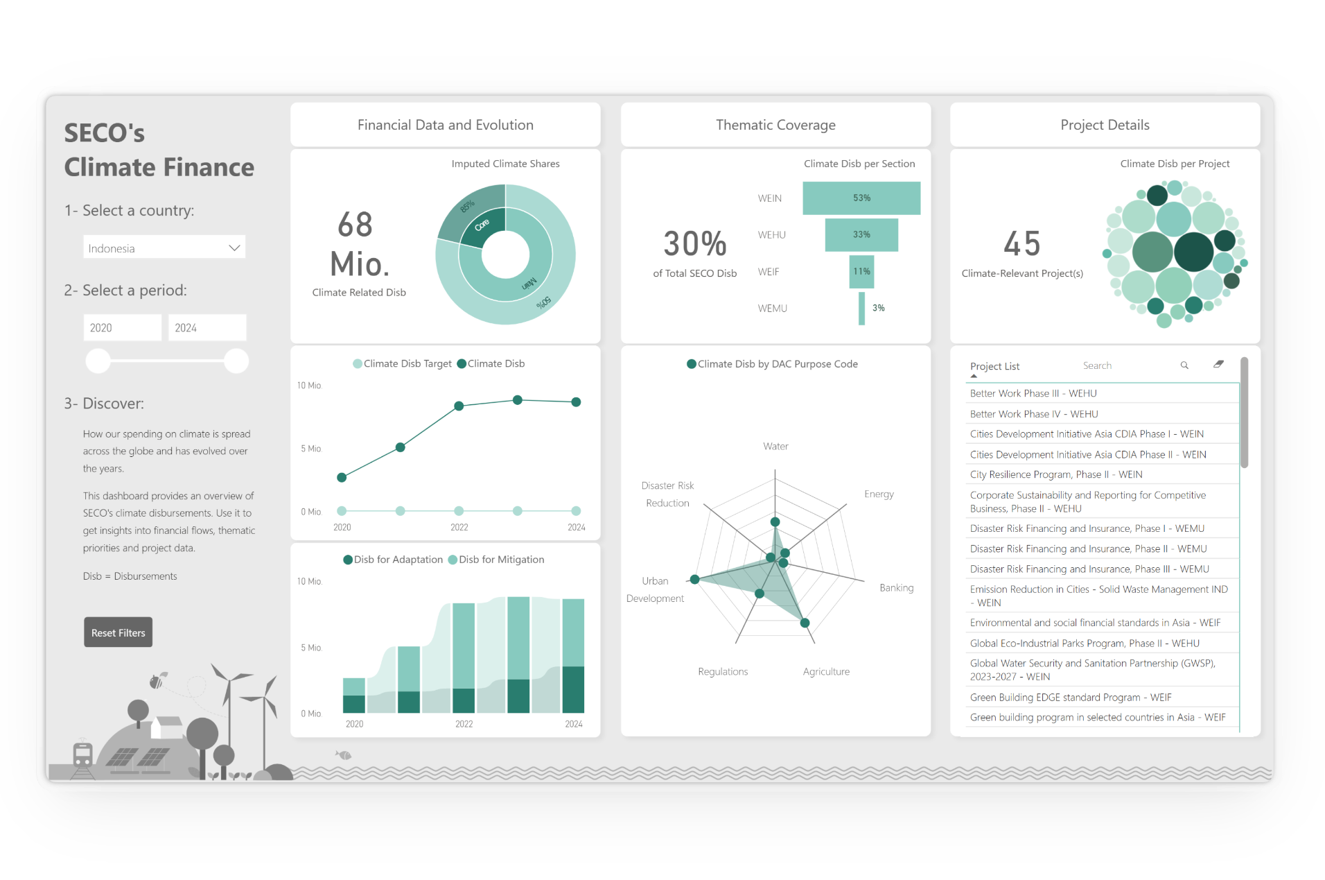
Final project for the CAS in Data Visualization at HKB and inspiration for the released Climate Cockpit.