Case Study
100 Billion USD for Climate
From experimental concept to real-world implementation: exploring how data visualization can help stakeholders understand where Swiss climate investments go and support more informed decisions.
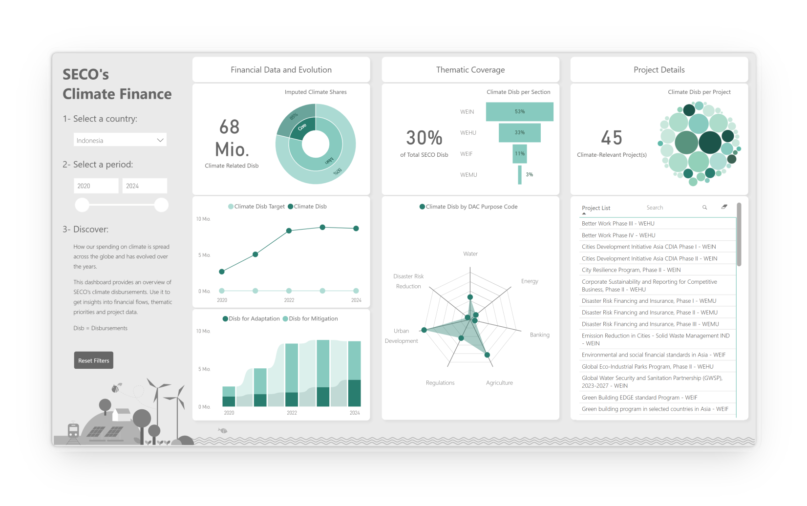
Overview
Are climate funds being invested where they are needed most?
In 2009, industrialized countries pledged to mobilize USD 100
billion per year to help developing countries address climate
change. The State Secretariat for Economic Affairs (SECO)
contributes to Switzerland's commitment through its international
cooperation programs.
While climate investments were managed within
individual projects, there was no country-level overview to
support strategic decision-making.
This project explored how data visualization could transform
climate finance data into an interactive dashboard that supports
exploration and strategic decision-making. Building on this
foundation, I later developed SECO's live Climate Cockpit.
Product
Interactive Power BI dashboard visualizing Swiss climate finance across countries, themes and projects. Later evolved into SECO's live Climate Cockpit.
Users
Climate Network members, Financial Controllers and Country Focal Points within SECO's Economic Cooperation and Development Division.
Team
Individual project
Problem
Where are the millions going?
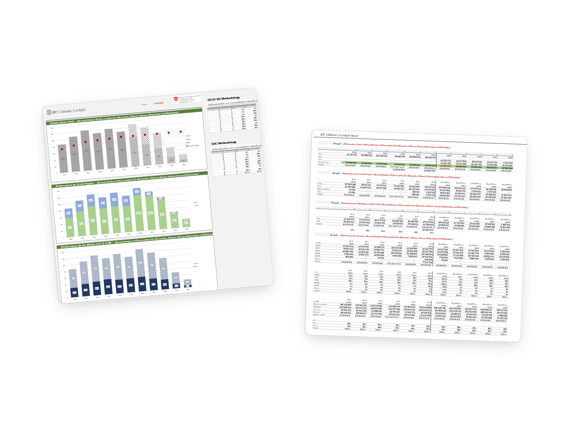
Reporting over insight
Data was collected to report on climate finance, not to explore patterns or support strategic decisions.
No country-level insights
Stakeholders could not see how climate investments differed across countries.
Manual and static reporting
Reporting relied on scattered and manually maintained Excel files with limited interactivity.
Hidden insights
Patterns, trends and opportunities for action remained difficult to discover.
Role
End-to-end ownership from concept to implementation, including information architecture, data visualization, UI design, Power BI development, and the evolution of the concept into SECO's live Climate Cockpit.
Constraints
Balancing creative exploration with real-world implementation. While the concept phase encouraged experimentation, the production dashboard had to meet technical constraints and organizational policies on Power BI visuals as well as real users and organizational needs.
01
Exploring
Killing my favorite charts.
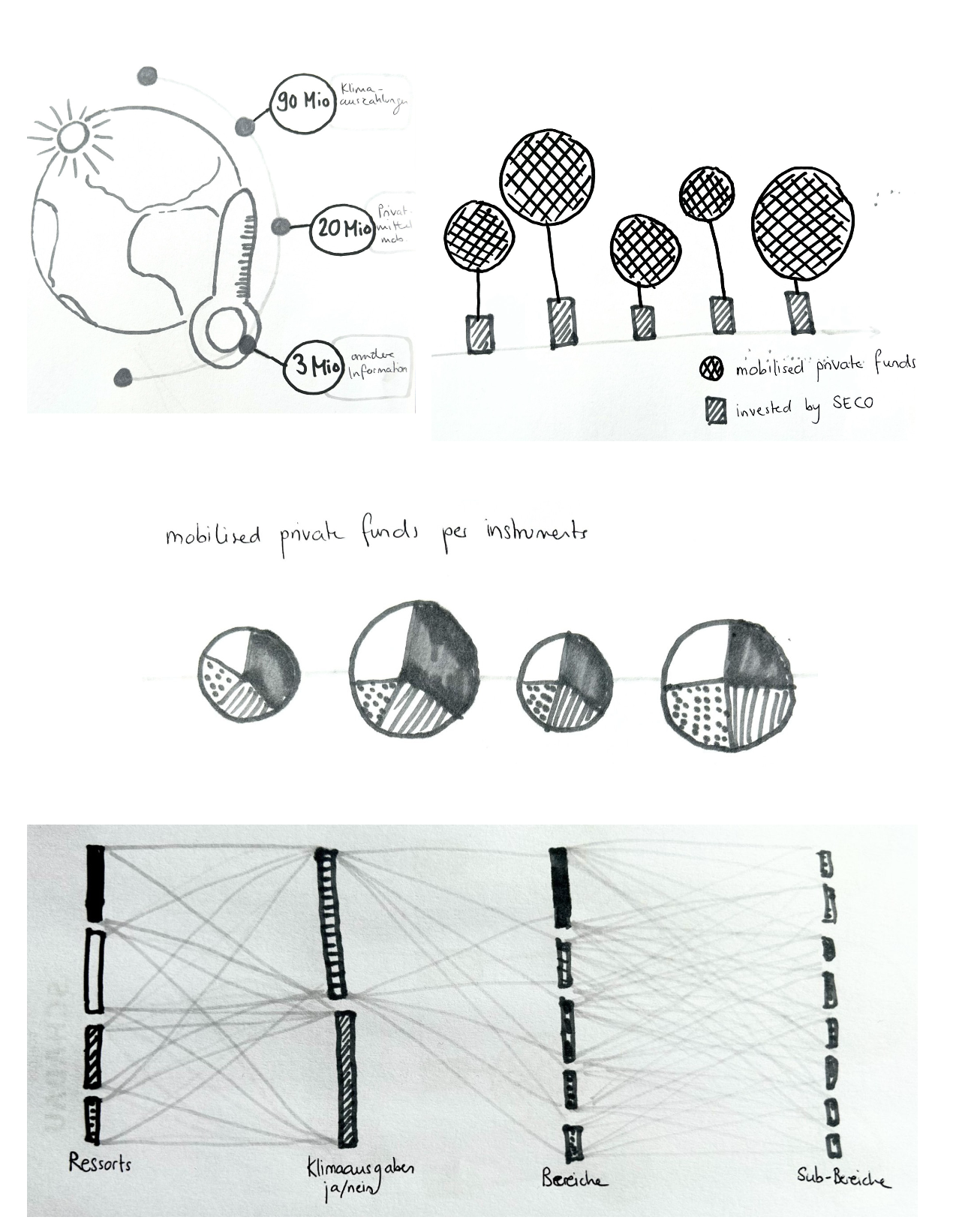
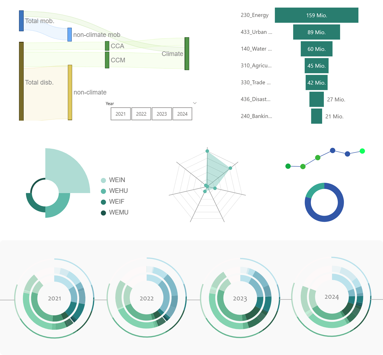
I explored numerous visual approaches, from Sankey diagrams and radar charts to bubble charts and sunburst diagrams. Some looked impressive but were difficult to read. Others were technically impossible to implement in Power BI. Many simply did not communicate the story I wanted to tell.
Every failed attempt became a learning opportunity and deepened my understanding of the strengths and limitations of data visualization.
Challenge
Finding visualizations that were informative, aesthetically pleasing, technically feasible and understandable to non-experts.
Solution
Embrace experimentation and allow unsuccessful ideas to become part of the design process rather than treating them as failures.
First ideas on paper
First attempts in Power BI
02
Designing
Designing the experience.
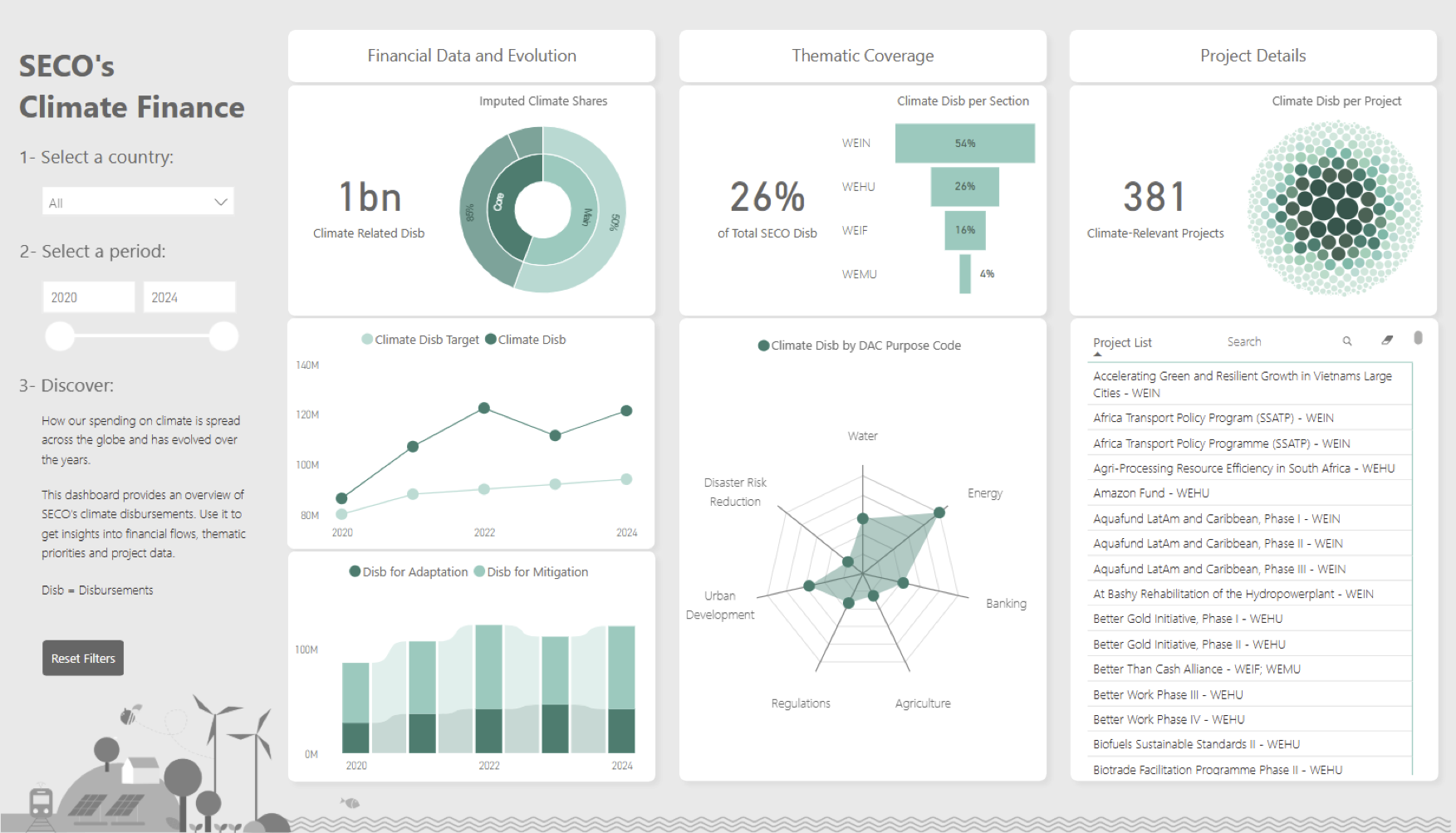
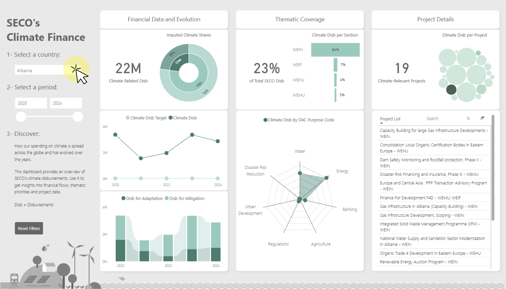
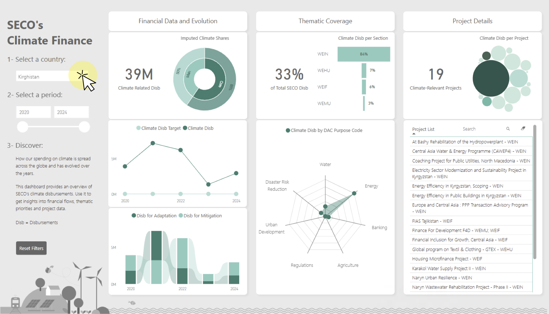
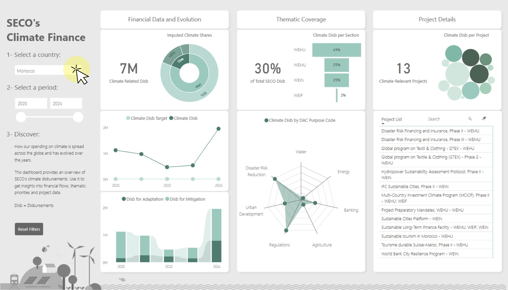
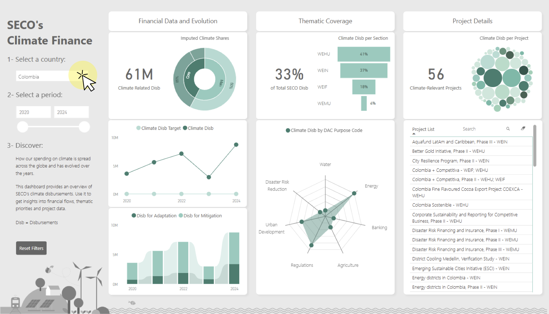
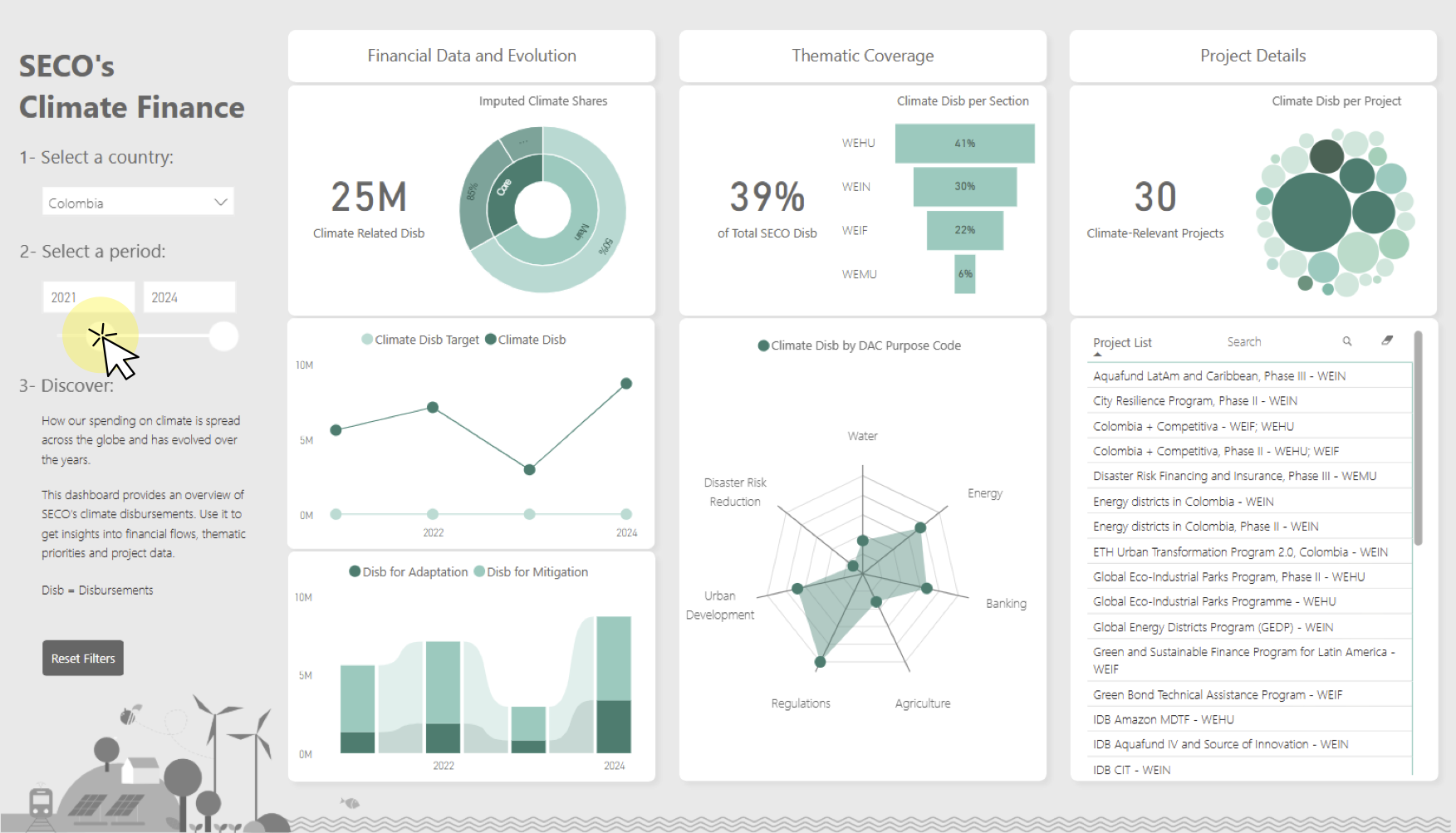
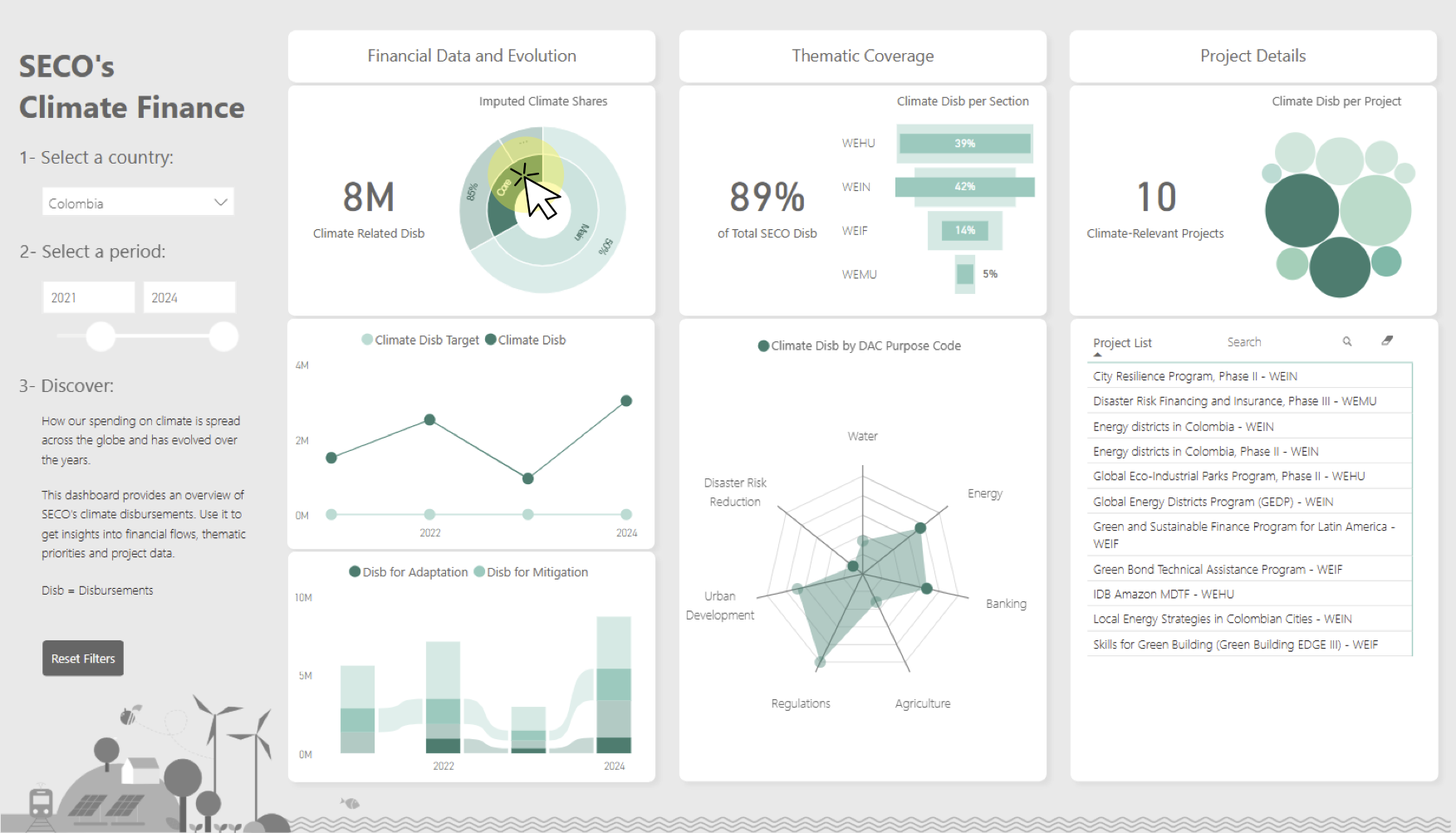
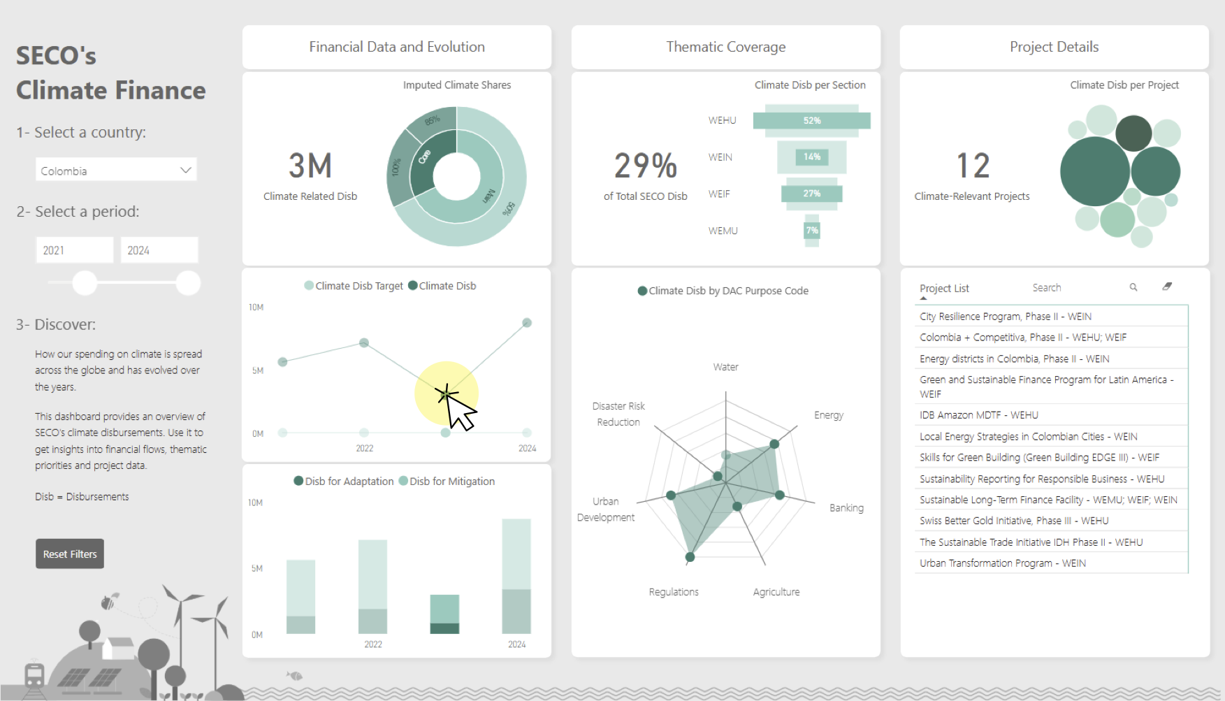
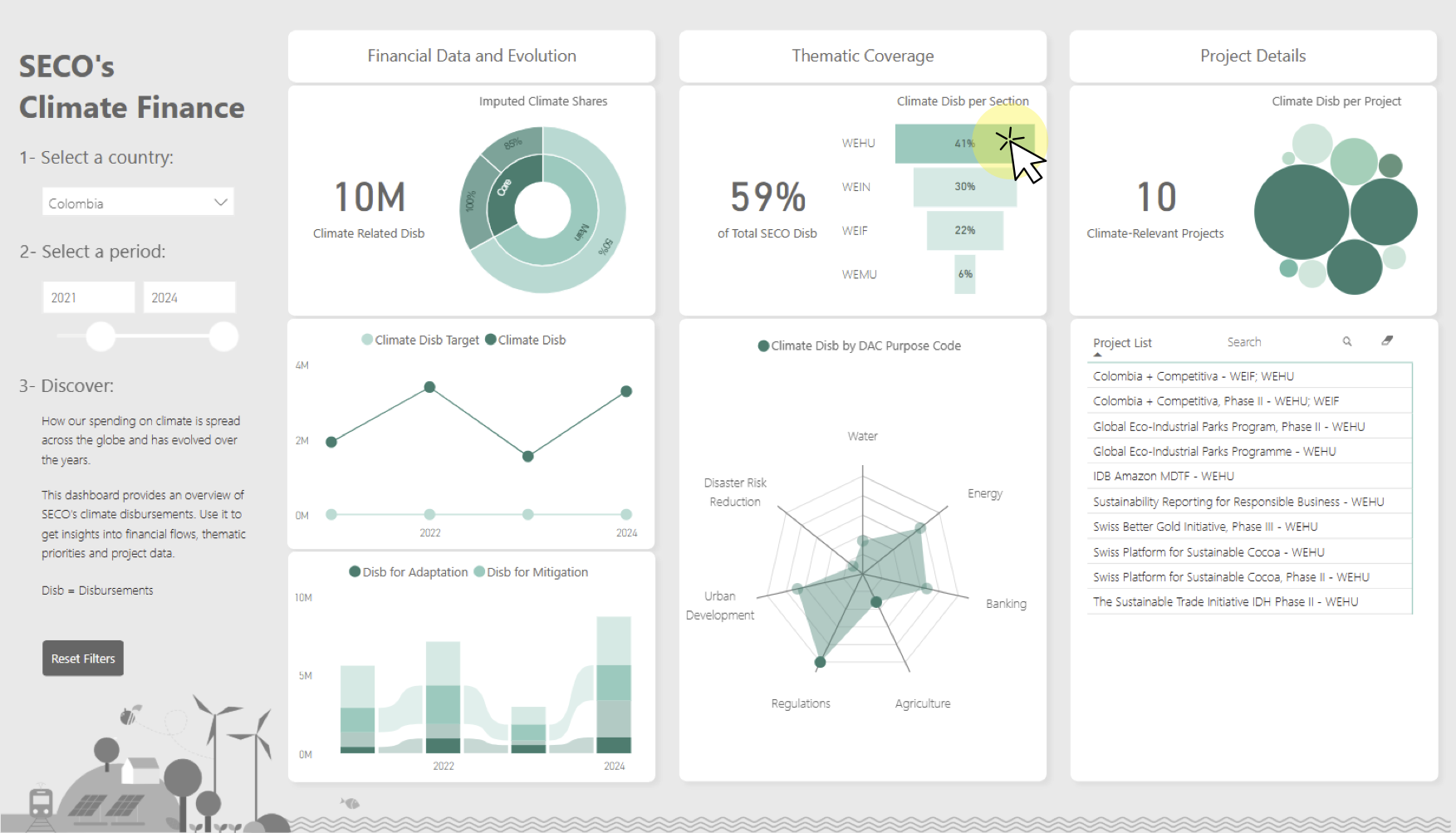
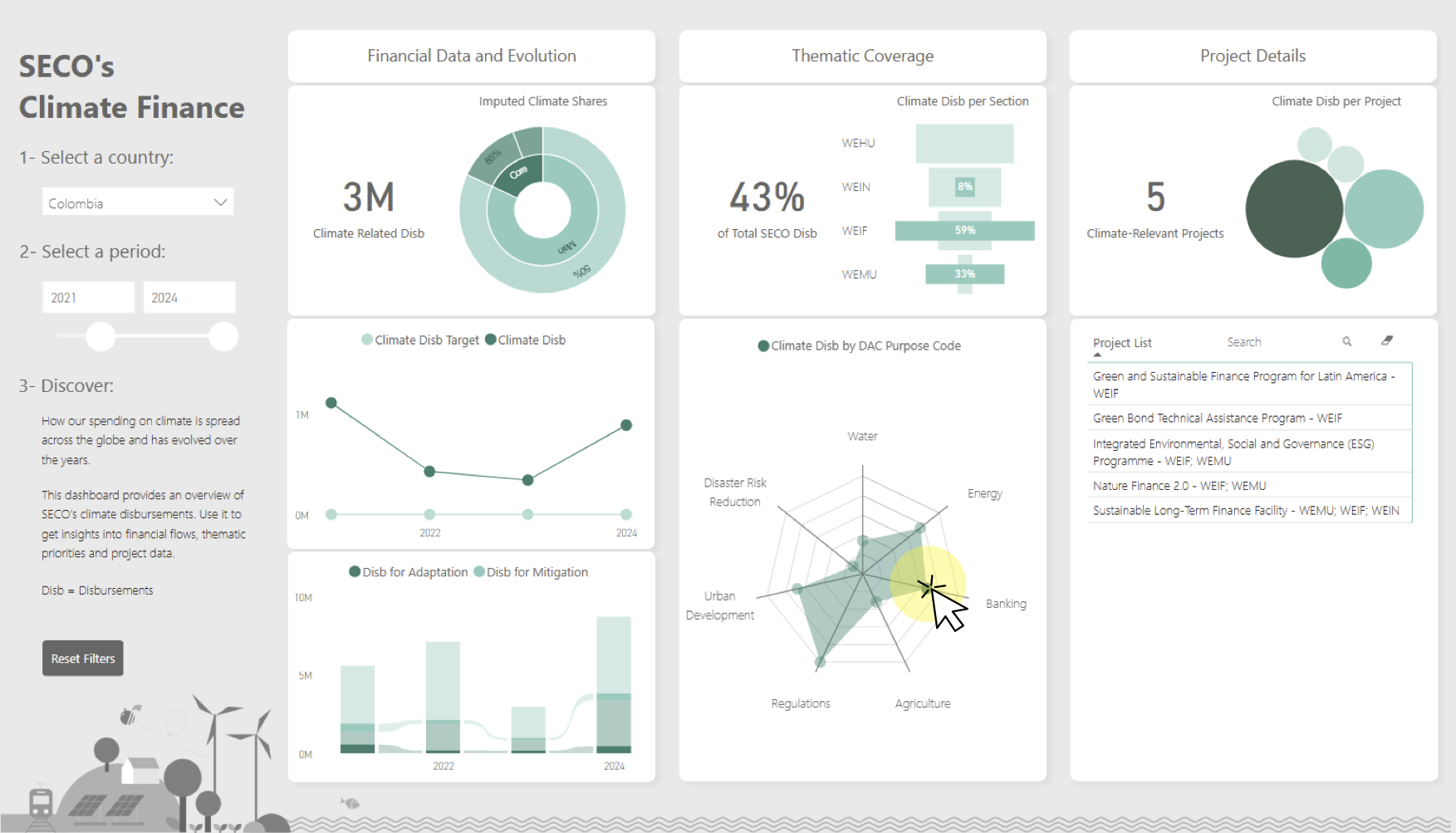
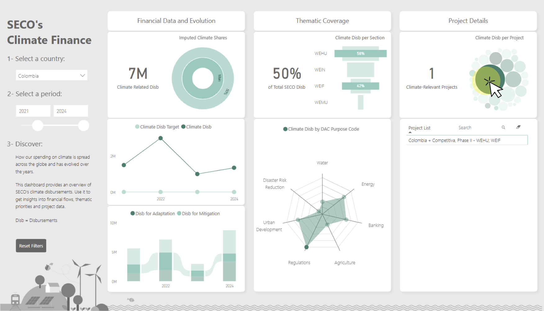
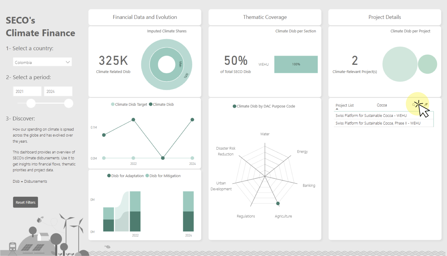
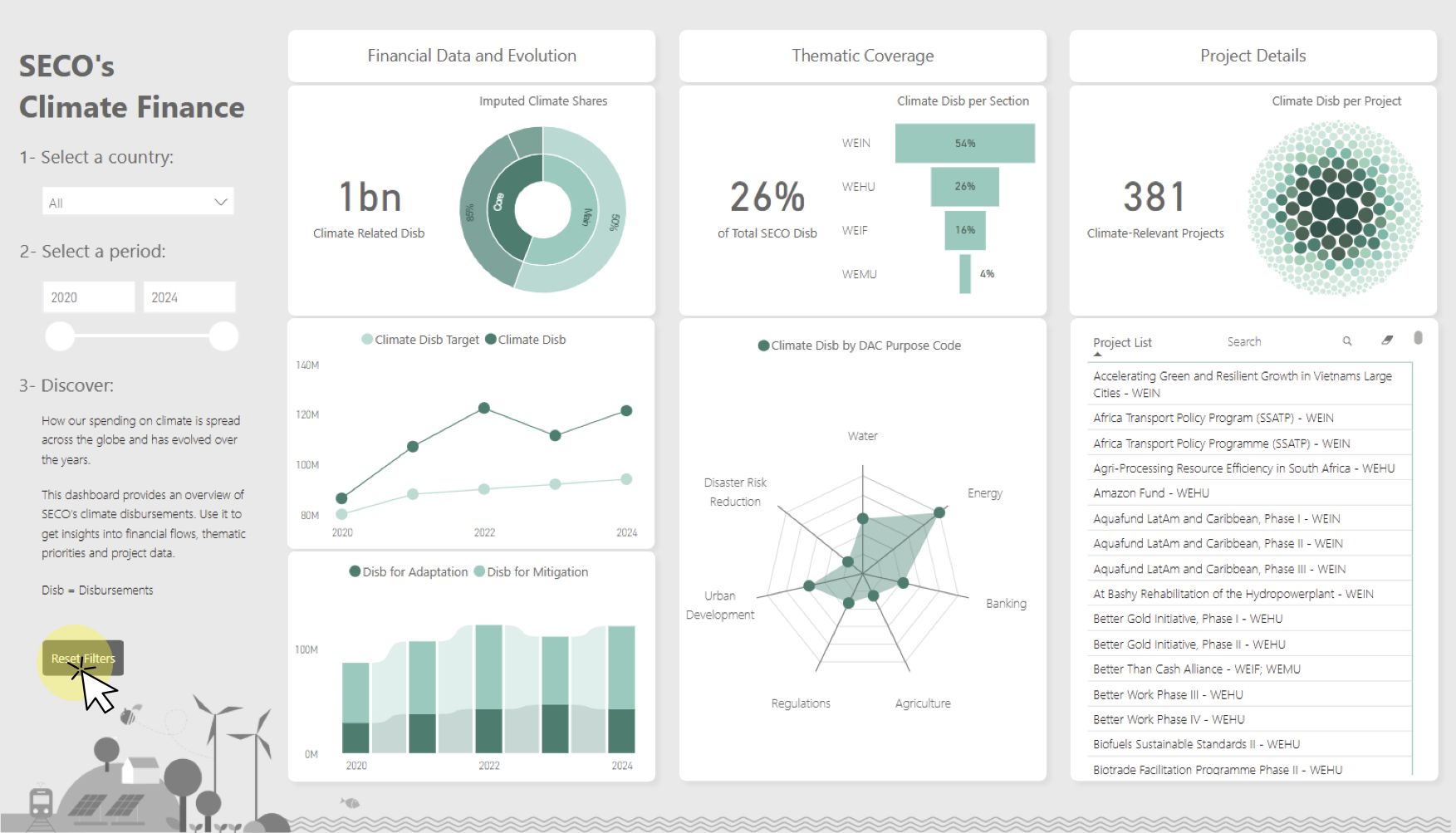
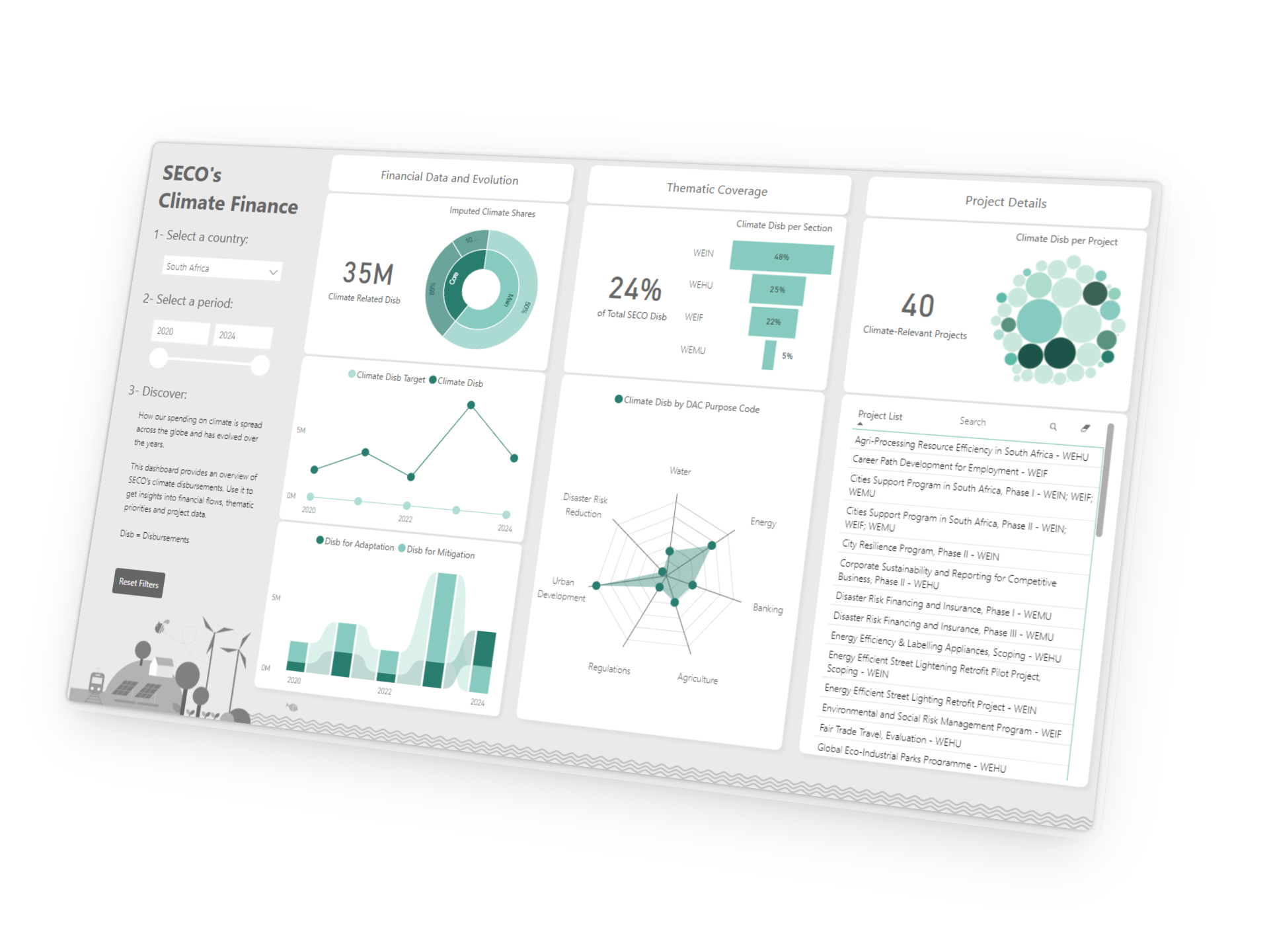
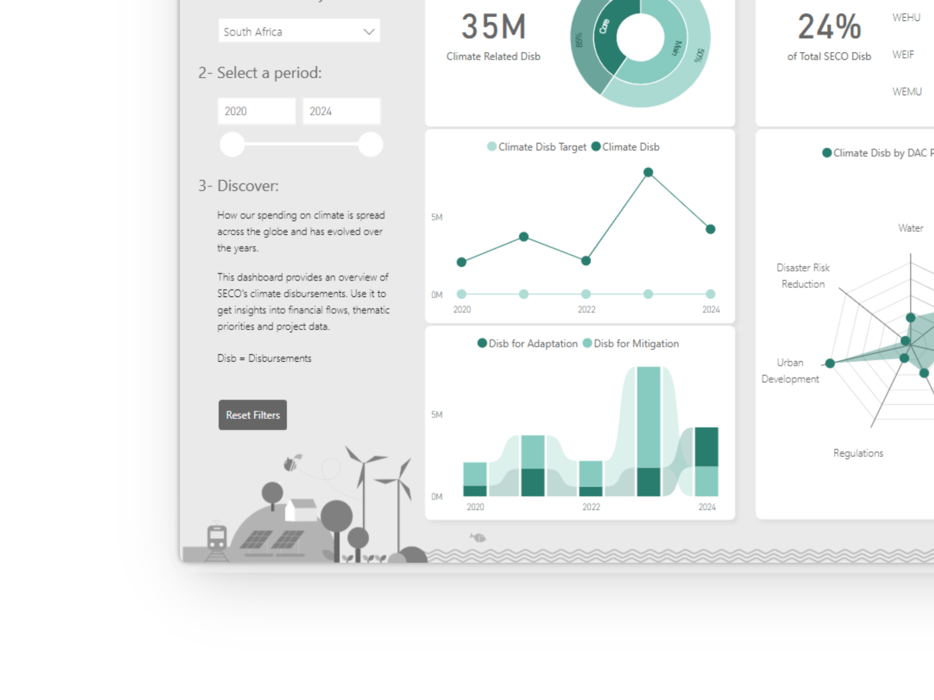
After exploring different visual approaches, I focused on turning the findings into a coherent and engaging experience. The final dashboard combines storytelling, information design and exploratory interactions to help users discover patterns hidden in climate finance data.
Challenge
How do you make climate finance data feel engaging and exploratory without overwhelming users?
Solution
Combine clear structure, minimal visual design and interactive storytelling to guide users from overview to detail.
Design decisions
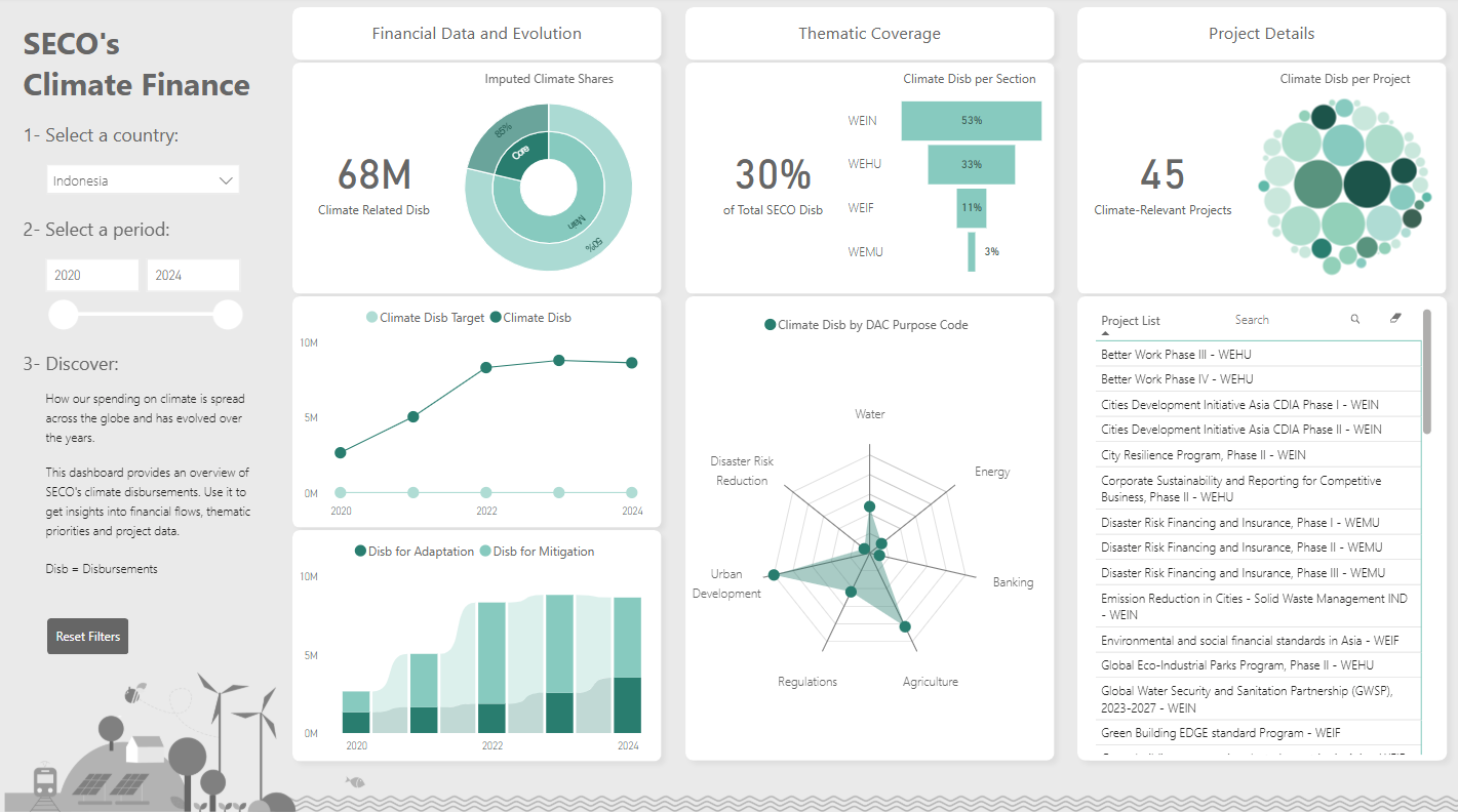
Introduce before exploring
An introduction and intuitive filters provide context before users start exploring the data. This helps them understand what they are looking at.
Progressive exploration
The dashboard progresses from a broad overview to increasingly detailed project information. Users can choose the level of detail they want to explore without feeling overwhelmed.
Group by topic
Visualizations are organized by theme, allowing users to scan the topics that interest them and connect related insights across multiple charts.
Reveal meaningful patterns
The dashboard is designed to highlight differences and similarities between countries, helping users identify trends, compare contexts and uncover meaningful patterns in the data.
Understand change over time
Time-series visualizations help users explore how climate investments have evolved over the past years, making long-term trends and emerging shifts easier to identify.
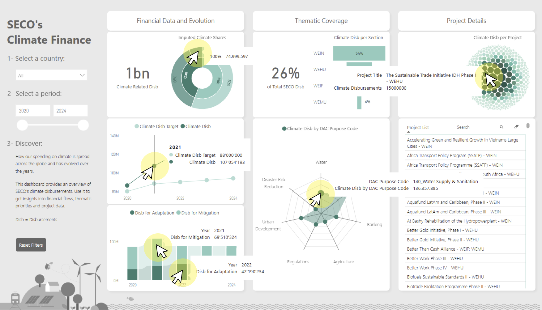
Interactive navigation
Interactive navigation allows users to move seamlessly between high-level patterns and project-level information, making it easy to explore the data at different levels of detail.
Less is more
A restrained color palette keeps the focus on the data rather than the interface, reducing visual noise and allowing important information to stand out.
Prioritize clarity over decoration
Icons and additional color coding were deliberately avoided in some areas to prevent unnecessary cognitive load.
Design for readability
Typography and spacing were carefully chosen to keep dense information easy to scan, making numerical values and chart labels readable at a glance.
Illustrations as atmosphere
Custom illustrations created in Adobe Illustrator add visual personality and reinforce the climate theme without competing with the data for attention.
03
Building
Building within limitations.
Power BI turned out to be both empowering and frustrating. Many of the visual ideas that seemed promising in theory could not be implemented because of technical constraints, custom visual limitations or performance issues.
In addition, some custom visuals were not approved by my organization and therefore could never be used in a production environment. The challenge became finding creative alternatives while preserving the original vision of the dashboard.
Challenge
Balancing design ambitions with technical and organizational constraints.
Solution
Focus on the underlying user need rather than on a specific visualization and continuously adapt the design to what was technically and organizationally feasible.
Me trying to make ambitious ideas come true.

04
Evolving
From concept to reality.
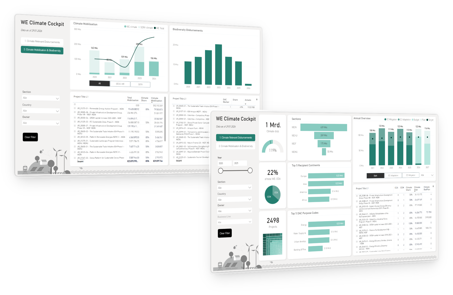
Although the original dashboard remained a conceptual prototype, I later built on its foundation to develop SECO's live Climate Cockpit. The dashboard was adapted to address concrete business needs and integrated into the Financial Cockpit ecosystem (see case study "Yellow is the new green").
Together with the Climate Network, I tested the dashboard, iteratively refined it based on user feedback and successfully rolled it out for everyday use.
Challenge
How do you translate an experimental student project into a practical tool that addresses real organizational needs?
Solution
Preserve the underlying ideas and adapt the dashboard to new requirements, users and technical constraints through continuous feedback and iteration.
Final Product
Where the millions are.
Impact
From climate reporting to climate insight.
100M+
CHF yearly Swiss climate finance tracked geographically and thematically through one interactive dashboard.
95%
Reduction in reporting time for financial controllers by replacing manual Excel analysis with automated reporting.
3×
More environmental information available than before, expanding reporting beyond climate change to include biodiversity and private sector mobilisation.
Testimonial
"Anouk developed the Climate Cockpit for the SECO Economic Development Climate Network. Throughout the project, she proactively gathered user requirements and, using interactive prototypes, tailored the dashboard to meet the specific needs of the network.
The result is a clear and flexible analysis tool that—unlike the previous cockpit—enables fast and versatile data queries while presenting the results in a visually clear and accessible way. The new cockpit is already being widely used and has received consistently positive feedback throughout the network. Thanks to her friendly and positive approach, Anouk also succeeded in engaging network members enthusiastically in the development of the new cockpit.
We sincerely thank Anouk for her valuable contribution."
"[...] A clear and flexible analysis tool that enables fast, versatile data queries and has received consistently positive feedback across the network.[...]"